If I understand your statement, the arrows to the left of each region were setup as toggles with hide and show.The list is very good.
Suggestion would be if a used could minimize the regions that one is not looking in. FWIW

If I understand your statement, the arrows to the left of each region were setup as toggles with hide and show.The list is very good.
Suggestion would be if a used could minimize the regions that one is not looking in. FWIW

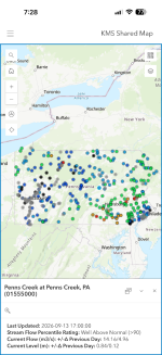
I’ve added the colored dots to my shared map. The only source I have for USGS data is metric (Canadian) - so no cfs, sorry - but at least the color levels come through. Flow vs height data are a function of what the gauge reports, but both are displayed if you tap a dot, along with change from previous day.Pennsylvania water conditions
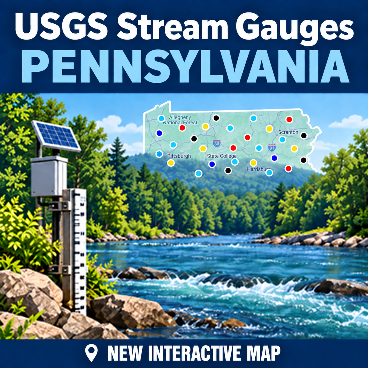
Explore USGS monitoring locations within Pennsylvania that collect continuously sampled water datawaterdata.usgs.gov
This does work, but not nearly as well as before.
The ideal scenario would be:
1) As you hover over the dots on the map, the stream and location info should appear.
2) Then you click the dot to select the gauge and the chart with the flow rate (cfs) for the last 7 days is displayed.
IMHO, the default should be CFS, not gauge height. I think cfs is more intuitive, more meaningful than gauge height.
Thank you. Working on features and locations that will best serve the whole fly fishing community.I used to reference the gage at pocono creek / wigwam. It was in cfs. It is now only gage height but they baseline the graph at 9ft. Pocono is a smaller stream and 9ft would be a catastrophic amount of water. I now reference the brodhead gage and figure a comparison flow. UGSS really made some of these gages difficult and almost useless. You did a good job Dave.
Thank you Dave!!! Just like christmas! 🙂If I understand your statement, the arrows to the left of each region were setup as toggles with hide and show.
View attachment 1641253827

Thanks for the feedback and sharing of the other map. A strong visual representation of the USGS data. It’s good to see some alternative interpretations of the maps. The USGS left us for years with and still do with very limited user interfaces. They never have lacked a lot of imagination.This is a great service @DaveKile! Love seeing the trend statement (rising/steady/falling), since that's usually the key info I'm looking for.
Totally as a source of amusement, someone mapped all the river flows as a visual tool here: https://norway-charts.netlify.app/river_flow_map_usa/
(NB: the map does not pinch-to-zoom. Took me an embarrassingly long time to find that Cmd-scroll [Mac] up/down zooms in/out.)


 www.paflyfish.com


I added your rollover suggestion earlier. Is it working like you thought?It looks and works good. It's very useful.
This is very minor suggestion, and probably not everyone would agree with it, but I suggest making the circles for the gauges slightly smaller. That way as you navigate across the map, you'd have less inadvertent window pop-ups.
Yes, it works well, and is very useful. Thanks for adding that.I added your rollover suggestion earlier. Is it working like you thought?
That is a good request. At this time I'm not sure how to do something like that. Currently it works as in independent page polling the USGS, NWS and Google for data and displaying back here on the site. It's more complicated tying in personnel information and yes account tie in would be required. It maybe something that I can tackle down the road.Great job DAVE and forgive me if I missed something OBVIOUS but...
Stream gauge information to ME is only relevant if I know the particular stream so well that I know if it is at X feet and Y cfm to either hop in the car or stay home.
For that reason, I have a spreadsheet where I enter stream flow & height from the USGS for a particular stream over several trips to determine MY ideal levels. When I look at the live time readings of less familiar water, I'll compare them to my spreadsheet before making a embarking decision.
What would be great (if it isn't already possible on your page) was if there was a login or something to enable user editable field(s) for particular gauges. In those fields I could plug in MY ideal level info so cross-referencing was unnecessary except the first time you plugged in the data.
I would assume that a login/account would be necessary to enable something like this, but if that was optional except for user editable fields, it might not be a big deal.
Or am I wrong?
I think you are correct. My goal here was to capture the best features of the old USGS Map, USGS Table roll them into one page and add other useful services like the NWS. This version achieved about 99% of what I imagined back in January after the USGS dropped all our pages. I think it has more features already than the old setup.Yes, it works well, and is very useful. Thanks for adding that.
If I remember correctly, the old USGS map had that feature, but the new USGS map does not.